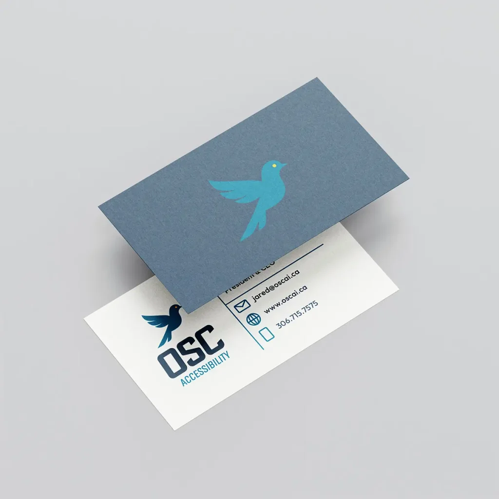
The OSC Accessibility logo features a bird symbolizing freedom, hope, and movement—perfectly representing the company’s mission to help people achieve independence through improved accessibility. The bold typography conveys strength and reliability, while the clean, modern design communicates professionalism and care, aligning with OSC’s goal of empowering individuals to live freely.