At Moab Media I try to intertwine deeper meaning and symbolism into each and every logo I design. The Monarch Management logo is no different, it combines strength and sophistication through a minimalist butterfly icon. Its symmetry conveys balance and reliability, it’s also simple and memorable, which is important. The mark symbolizes growth, transformation, and stability—perfect qualities for a property management company that values excellence and care. Our goal is to create simple and eye catching brand marks that stand the test of time and I believe this has been achieved with this logo here.
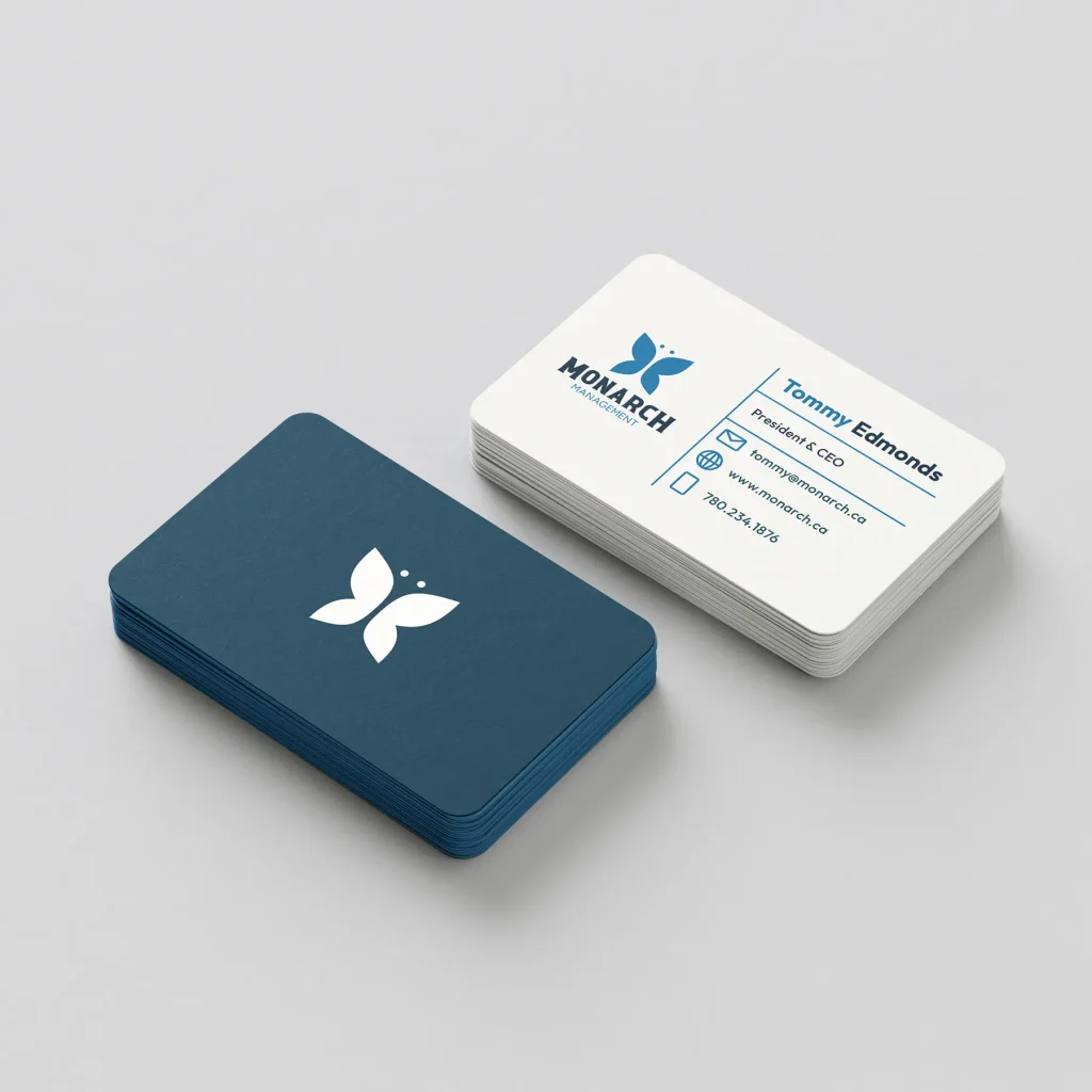
The deep blue used in the Monarch Management logo symbolizes trust, reliability, and confidence which are are essential qualities for a professional property management company. Paired with an off-white background, it adds warmth, balance, and approachability. Together, the colors create a timeless and sophisticated visual identity that feels both strong and welcoming to clients.